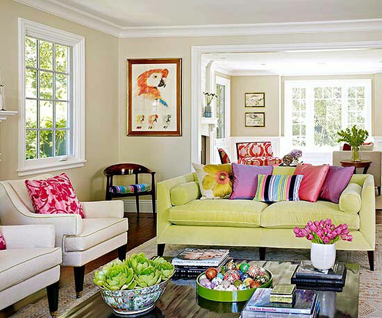
Hi all- A few days ago a good friend asked me to “run in and give her ideas for her family room.” I didn’t feel like I was much help and then I was on the BH&G website and found some inspiration for her. I thought I would share with you all if you are looking for a little furniture flipping! The one suggestion another good friend gave me when re-arranging furniture is to clear the room (as much as physically possible) to have a blank slate.
I found my own family room inspiration with this Pottery Barn ad last fall. This layout changed my world.. or at least my world from my family room’s perspective.
Sidenote: We JUST removed the shutters which opens up the room like we never imagined!
Here’s some more inspiration from BH&G. Look, no window treatments!
This layout is an example of angles. I don’t know if I can pull off an angle. Who has tried a similar furniture layout?
Here’s a fan favorite with seating facing in and a sofa table to divide the space/room behind the sofa. Just wondering do you all say sofa or couch?
I love this look, but I don’t know how practical it is for a family who likes to lounge on the couch. I could see this in a living room. What do you think?
And, I saved my favorite for last! For me it’s a perfect mix of comfy and neat! Which one is your favorite?


My favo is the room with the model-boat.